Map
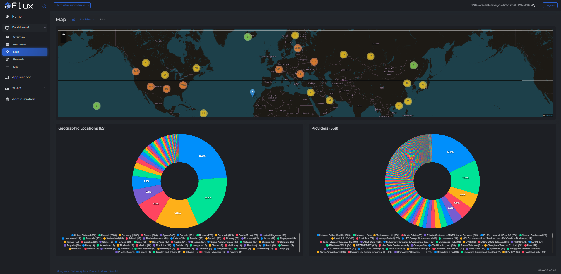
The Map tab visualizes the global distribution of FluxNodes and their providers.
What You'll See
This dashboard displays the following information:
- World Map
- Interactive map plotting the geographic locations of all active FluxNodes.
- Clustered markers indicate node density by region.
- Geographic Locations
- Pie chart illustrating the proportion of FluxNodes in each country.
- Countries are labeled with counts and percentage shares.
- Providers
- Pie chart showing the distribution of FluxNodes by hosting provider.
- Helps understand the diversity and decentralization of infrastructure providers.